Intro to Data Journalism
City, University of London
https://ddj.nicu.md/city/
The process


Averages

=MODE()
Finds the most common value in a range.
=MEDIAN()
Finds the value that’s right in the middle of a dataset.
=AVERAGE()
Sum all the values and divide by the number of records.
How did the Mail do it?
2018

2019

Closed data

FOIs

Scraping

XLOOKUP

Pivot Tables
Pivot tables are extra tables in your spreadsheet, in which you can summarise data from your original table.
You can calculate averages, counts, max/min values or sums for numbers in a group.

Averages
=MODE()
Finds the most common value in a range.
=MEDIAN()
Finds the value that’s right in the middle of a dataset.
=AVERAGE()
Sum all the values and divide by the number of records.
The guide to bad data


OpenRefine

Why do we visualise data?
Summarising data, like we did in previous lessons, is not always enough to reveal pattern or trends.
Visualising it can provide insight we’d otherwise lose out on.

What can we visualise?
Position 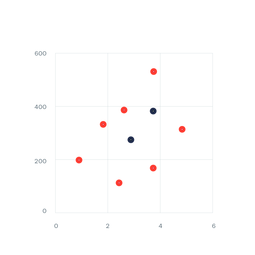
Size
Width 
Height 
Area 
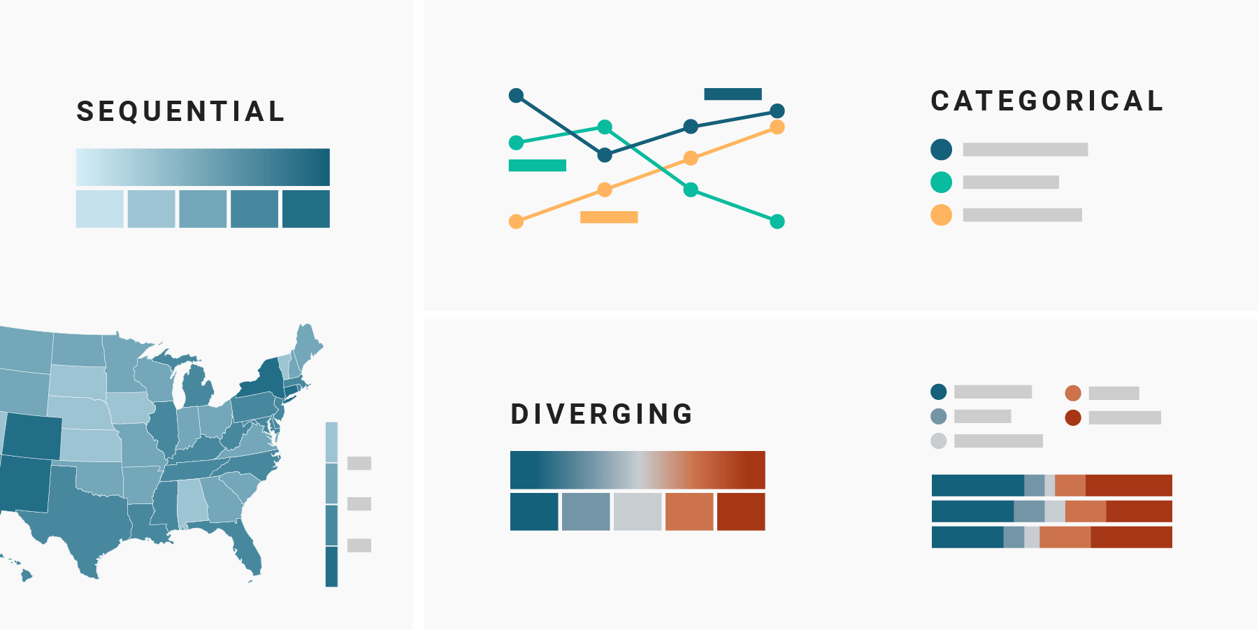
Colour
Fill 
Colour 
Opacity
Pattern
Shape 
Location 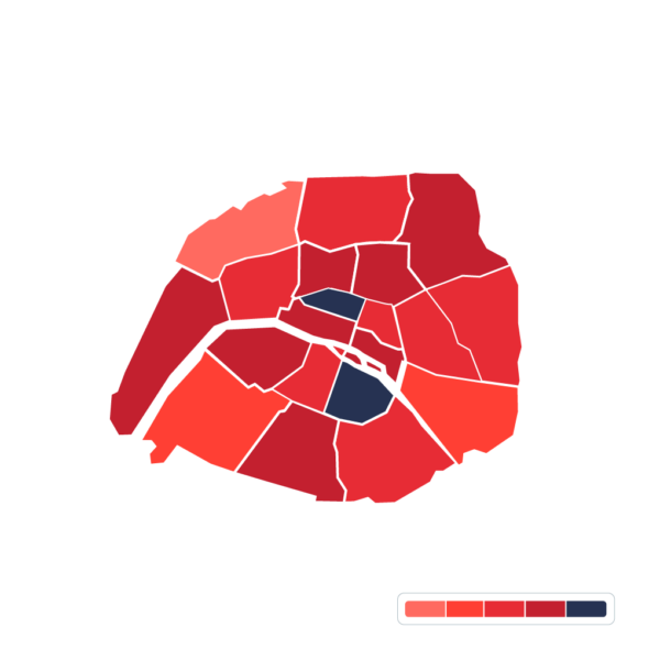
What visual encoding can you find in this chart?

The FT’s scatter plot
Standard scatter plot 
Change scale to log 
Size by population 
Colour by continent 
Animate over time
FT Vocabulary
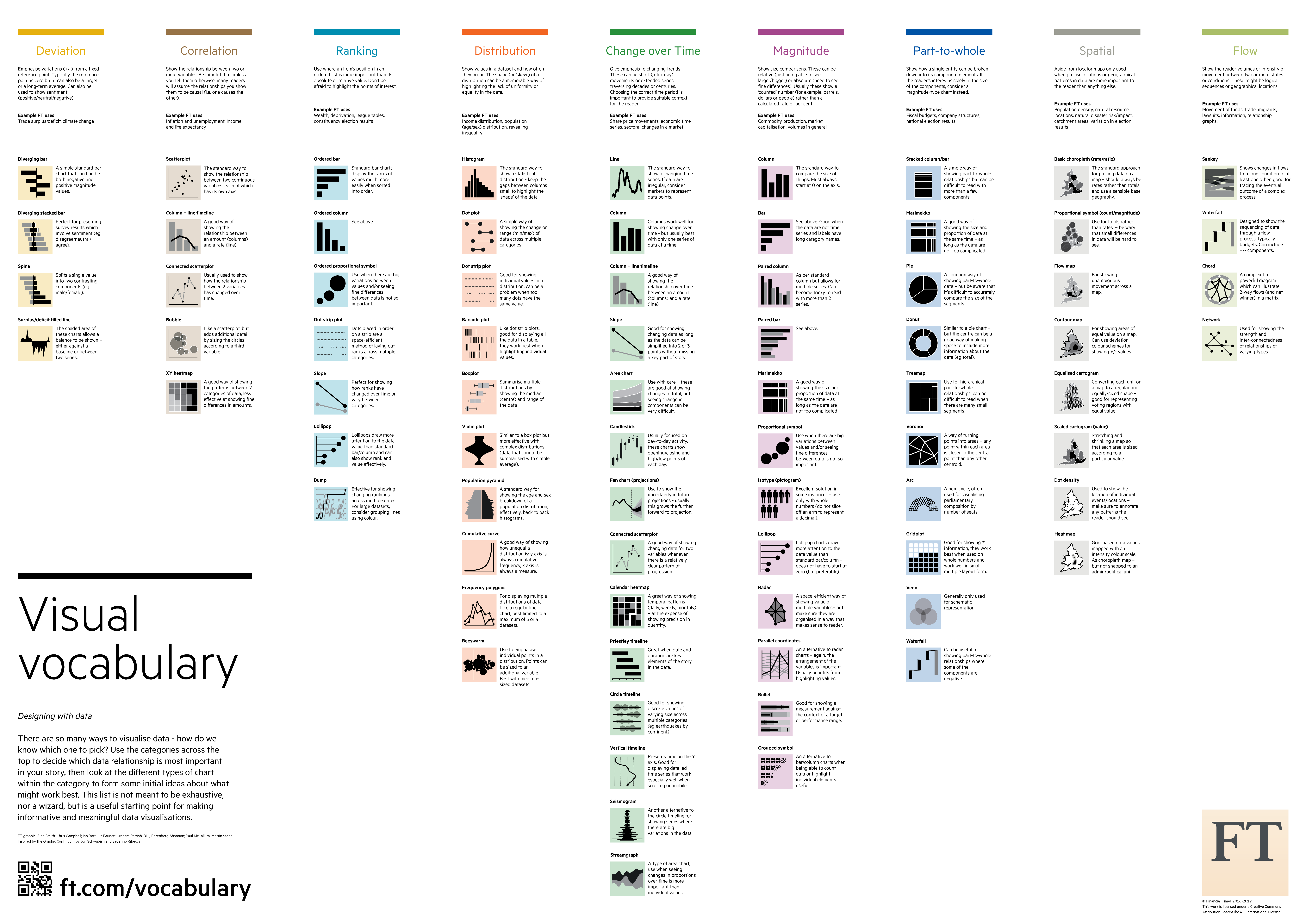
Bar/column charts
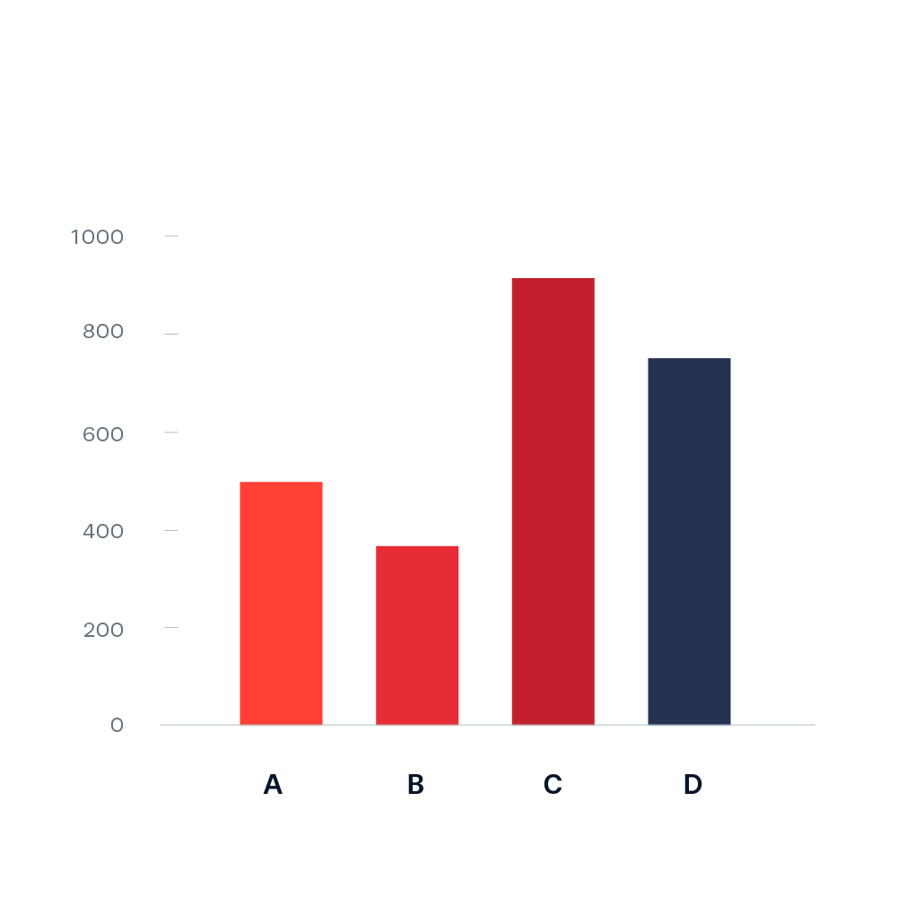
Horizontal or vertical rectangles with lengths proportional to the values that they represent.
Good for comparing across different values or showing a trend over time.
Line chart
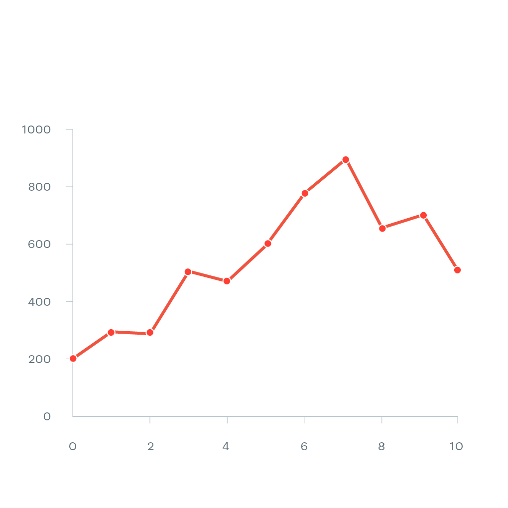
Shows values on a continuous scale. Similar to a scatter plot, except all dots are connected.
Good for showing trends over time.
Area chart

Similar to a line chart but the area underneath the line is coloured in. When stacked, it can show multiple data series as well as their cumulative trend.
Good for showing trends over time.
Scatter plot
Plots a dataset across two continuous dimensions, each on a different axis (X and Y).
Good for showing correlation between different data series.
Map

Only works with geographical data (duh!).
Even with geographical data, other charts can often be a better choice.
Anatomy of a chart

Colour scales
Bad charts: Daily Mail

Bad charts: The Sun

Bad charts: Reuters


Bad charts: CBS News

Choropleth
Pre-defined areas such as countries, regions or districts are coloured (either sequential, diverging or categorical) in proportion to values in a dataset.
Bubble/symbol map
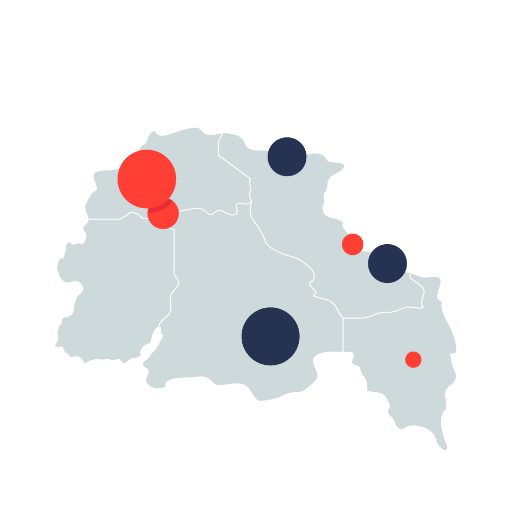
Circles are drawn on top of a map, with their size or colour proportional to values in a dataset.
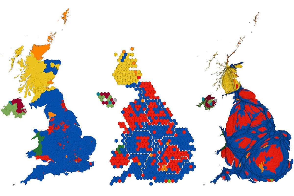
Cartogram / hex map

Cartograms resize regions in proportion to a variable in your dataset, such as population.
Hex maps standardise administrative units into same-sizes hexagons, squares or triangles.
The 2019 general election
Not always the right choice
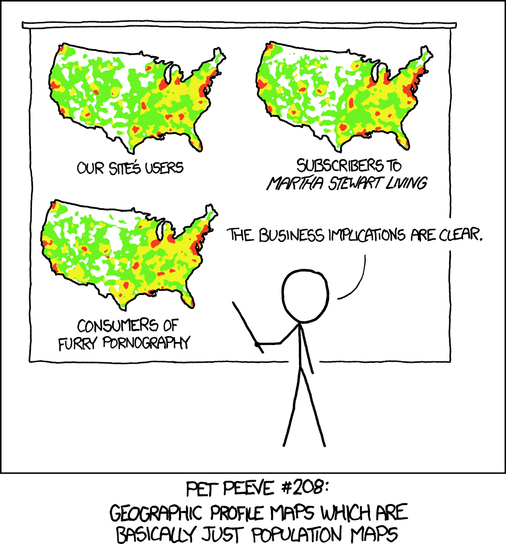
Try to only use maps when there’s a geographical pattern to your data.
Don’t make a map if it’s going to basically be a population map.
What data you’ll need

Geographical data
This can be polygons (areas), lines or points. Some tools have a few options by default, or you can get additional ones from the ONS, Natural Earth or ArcGIS.

Numerical or categorical data
This is the data that will be placed in the shapes on your map. Normally contains region IDs or coordinates (latitude and longitude).

Often, the best narratives warrant going further than simple graphics.

Tailored visualisations designed specifically for a story will almost always be the best way to tell a story.

Interactivity can sometimes help portray the intricacies of a story better.
The Martini Glass principle
